Colors
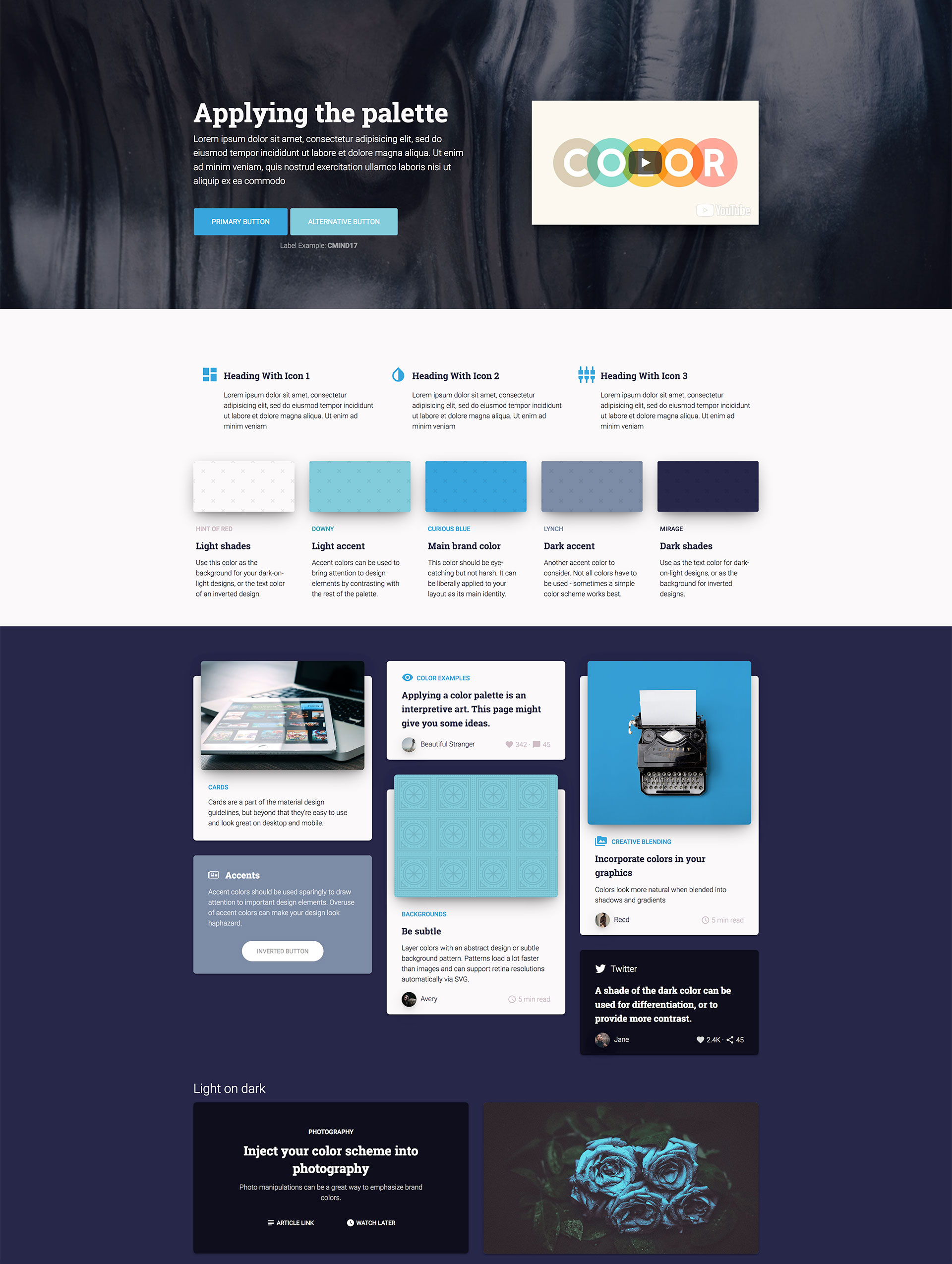
Hint of Red
Light shades
Use this color as the background for your dark-on-light designs, or the text color of an inverted design.
Downy
Light accent
Accent colors can be used to bring attention to design elements by contrasting with the rest of the palette.
Curious Blue
Main brand color
This color should be eye-catching but not harsh. It can be liberally applied to your layout as its main identity.
Lynch
Dark accent
Another accent color to consider. Not all colors have to be used - sometimes a simple color scheme works best.
Mirage
Dark shades
Use as the text color for dark-on-light designs, or as the background for inverted designs.
Headings
h1. This is a very large header.
h2. This is a large header.
h3. This is a medium header.
h4. This is a moderate header.
h5. This is a small header.
h6. This is a tiny header.
Paragraph
This is a paragraph. Paragraphs are preset with a font size, line height and spacing to match the overall vertical rhythm. To show what a paragraph looks like this needs a little more content so, did you know that there are storms occurring on Jupiter that are larger than the Earth? Pretty cool. Wrap strong around type to make it bold!. You can also use em to italicize your words.
http://keystocks-staging.codehammerhead.com/Lists
- Lorem ipsum dolor sit amet
- Lorem ipsum dolor sit amet
- Lorem ipsum dolor sit amet
- Lorem ipsum dolor sit amet
- Lorem ipsum dolor sit amet
- Lorem ipsum dolor sit amet
- Lorem ipsum dolor sit amet
- Lorem ipsum dolor sit amet
- Lorem ipsum dolor sit amet
- Lorem ipsum dolor sit amet
- Lorem ipsum dolor sit amet
- Lorem ipsum dolor sit amet
Button
Primary Secondary Success Alert WarningSo Tiny So Small So Basic So Large Such Expand
Callout
This is a default callout.
It has an easy to override visual style, and is appropriately subdued.
It's dangerous to go alone, take this.This is a primary callout
It has an easy to override visual style, and is appropriately subdued.
It's dangerous to go alone, take this.This is a secondary callout
It has an easy to override visual style, and is appropriately subdued.
It's dangerous to go alone, take this.This is a success callout
It has an easy to override visual style, and is appropriately subdued.
It's dangerous to go alone, take this.This is a warning callout
It has an easy to override visual style, and is appropriately subdued.
It's dangerous to go alone, take this.This is an alert callout
It has an easy to override visual style, and is appropriately subdued.
It's dangerous to go alone, take this.Table
| Table Header | Table Header | Table Header | Table Header |
|---|---|---|---|
| Content Goes Here | This is longer content Donec id elit non mi porta gravida at eget metus. | Content Goes Here | Content Goes Here |
| Content Goes Here | This is longer Content Goes Here Donec id elit non mi porta gravida at eget metus. | Content Goes Here | Content Goes Here |
| Content Goes Here | This is longer Content Goes Here Donec id elit non mi porta gravida at eget metus. | Content Goes Here | Content Goes Here |
Tooltip
The scarabaeus hung quite clear of any branches, and, if allowed to fall, would have fallen at our feet. Legrand immediately took the scythe, and cleared with it a circular space, three or four yards in diameter, just beneath the insect, and, having accomplished this, ordered Jupiter to let go the string and come down from the tree.
Pagination
Forms
Accordion
-
Accordion 1
Panel 1. Lorem ipsum dolor
-
Accordion 2
Panel 2. Lorem ipsum dolor
-
Accordion 3
Panel 3. Lorem ipsum dolor
Tabs
One
Check me out! I'm a super cool Tab panel with text content! On medium-down screen sizes, this component will transform into an accordion.
Two

Three
Check me out! I'm a super cool Tab panel with text content!
Four
Five
Check me out! I'm a super cool Tab panel with text content!
Six
Cards
Dreams feel real
I'm going to improvise. Listen, there's something you should know about me... about inception.
Last updated 1 minute ago
Menus
Cards play nicely with menus too! Give them a try.
Featured
Your title here!
An idea is like a virus, resilient, highly contagious. The smallest seed of an idea can grow. It can grow to define or destroy you.
And button groups...
Button groups also work great!
Example
This is not the final desing.
This shows how well the colors combine together
Full Screen Color Sample